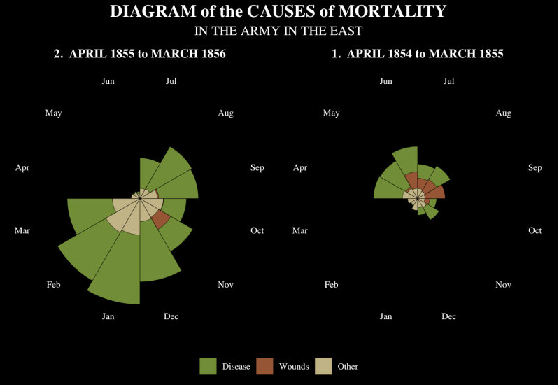
Florence Nightingales Rose chart
Florence Nightingale’s Rose Diagram : History of Information. (n.d.). Www.Historyofinformation.Com. Retrieved August 28, 2026, from https://www.historyofinformation.com/detail.php?entryid=3815
In 1858, Florence Nightingale, a nurse, statistician and reformer published notes on 'Matters affecting the health efficiency and hospital administration of the British Army, founded chiefly on the experience of the late war, presented by request to secretary state of war'
The data visualisation represents how the causes of death within the British war, between April 1855- March 1856 on the left, and April 1854-March 1855 on the right. Blue represents death caused by epidemic disease, pink represents death caused by wounds, and black represents other causes of death.

Data Card
Title: Diagram of causes of mortality in the army of the east.
Summary :The data visualization represents how the causes of death within the British war, between April 1855- March 1856 on the left, and April 1854-March 1855 on the right. Purple represents epidemic disease, Red represents death caused by wounds, and Blue represents other causes of death.
Data sources :Florence Nightingale’s Rose Diagram : History of Information. (n.d.). Www.Historyofinformation.Com. Retrieved August 28, 2026, from https://www.historyofinformation.com/detail.php?entryid=3815
Mapping : X axis – month and date (april 1854 – march 1856), Y Axis – number of deaths split into the 3 different categories of (disease, wounds, other)
Important notes : On the original data visualisation, the key is only understood if you read the paragraph explaining the colours, on new models there is a key that demonstrates the relation of colours to categories. It may also be difficult to understand proportions as there is no clear value in the visualisation, you can only gain understanding of these values from looking at the original set of data.
Access : Where you can access the original datasource - Dainer-Best, J. (2024, February 15). Labs for PSY 202 - Visual Displays of Information (Lab 3). Bard.Edu. https://faculty.bard.edu/~jdainerbest/stats/psy-202-s2024/labs/posts/03-visualizations/
My recreation of this Data Visualisation using R
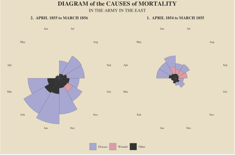
Recoloured Version
This is my recoloured version of Florence Nightingale's rose chart, published in 1858 as part of her report on mortality in the British Army during the Crimean War. I chose the colours green, brown, and beige to simulate the visual identity of the military, since the data was recorded from the army's military hospitals during wartime. The green represents death caused by disease. Brown represents deaths from wounds. The beige demonstrates death caused by other causes.